
Checking your site on phones and tablets
Preview every screen size before you publish.
Above the live preview on the right, choose Desktop, Laptop, Tablet or Phone to see your site at that size.
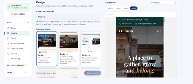
Every design works on every screen, so you don't need to build a separate phone version. In Advanced mode you can also set text sizes per device, and hide a section on phones or on computers.